Brand strategy
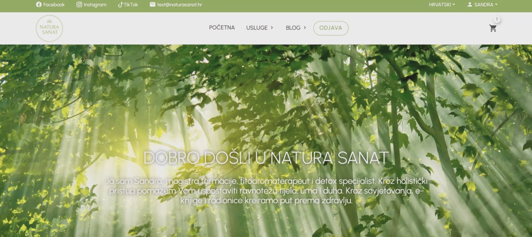
The focus moved from a generic wellness impression to Sandra's expertise, experience and personal way of working.

Case study · Wellness · 2026
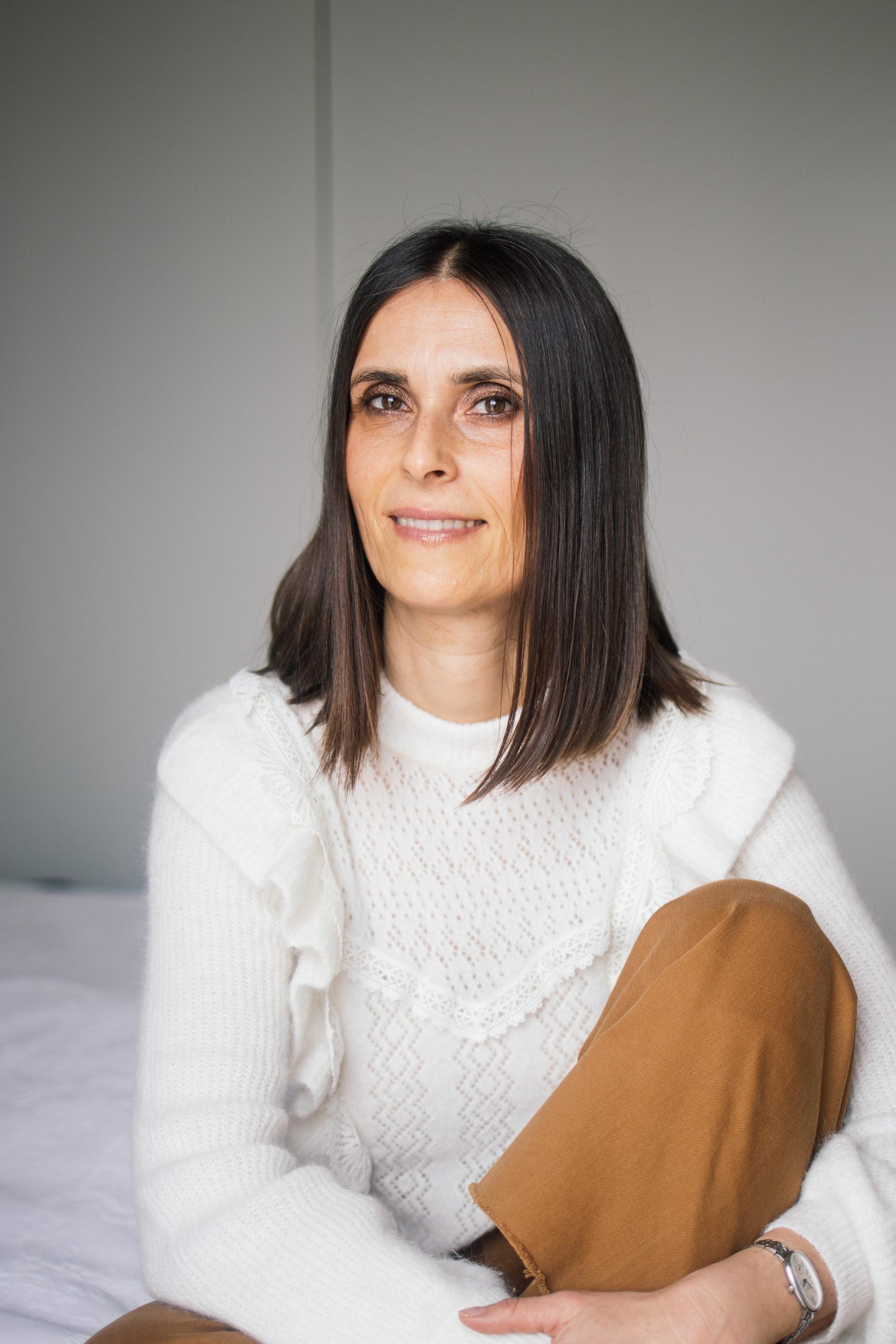
The expertise was there. The website hid it behind greenery, products and too many options.
01 · Before and after
 Sandra · Consultations · Talks · Knowledge
02 · The real problem
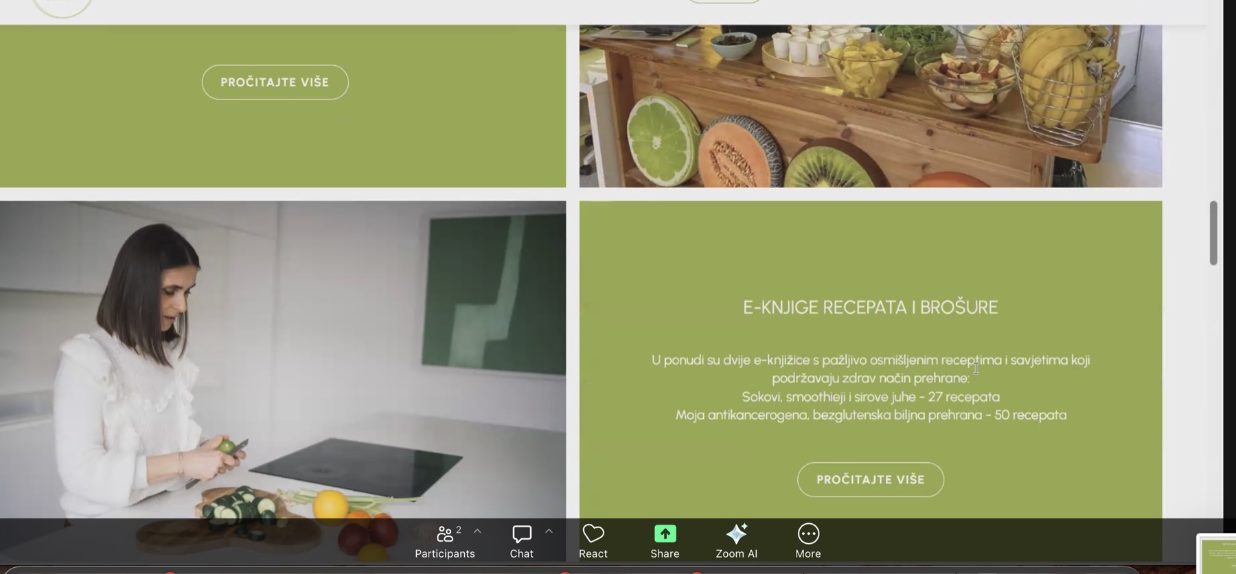
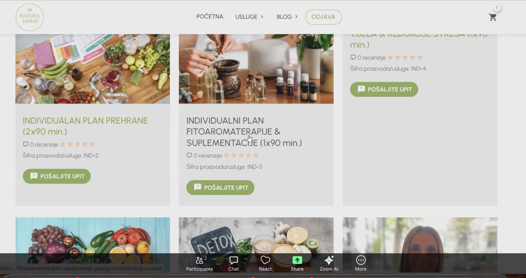
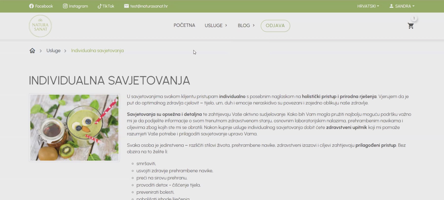
The old website combined consultations, products, ebooks, a blog and a webshop. Everything was present, but the hierarchy was unclear. Sandra's pharmaceutical education, experience and ability to explain complex subjects did not lead the story.
In health-related work this is more than a communication issue. If the boundary between expert education, personal consultation and medical treatment is unclear, the visitor receives either an oversized promise or too little reason to trust.
03 · Insight and approach
The continuity of the existing brand was retained, while communication was organised around the person who conducts the consultations, delivers the talks and signs the content. Expertise was translated into clear services, useful answers and responsible boundaries.
04 · Booklets and AI illustrations
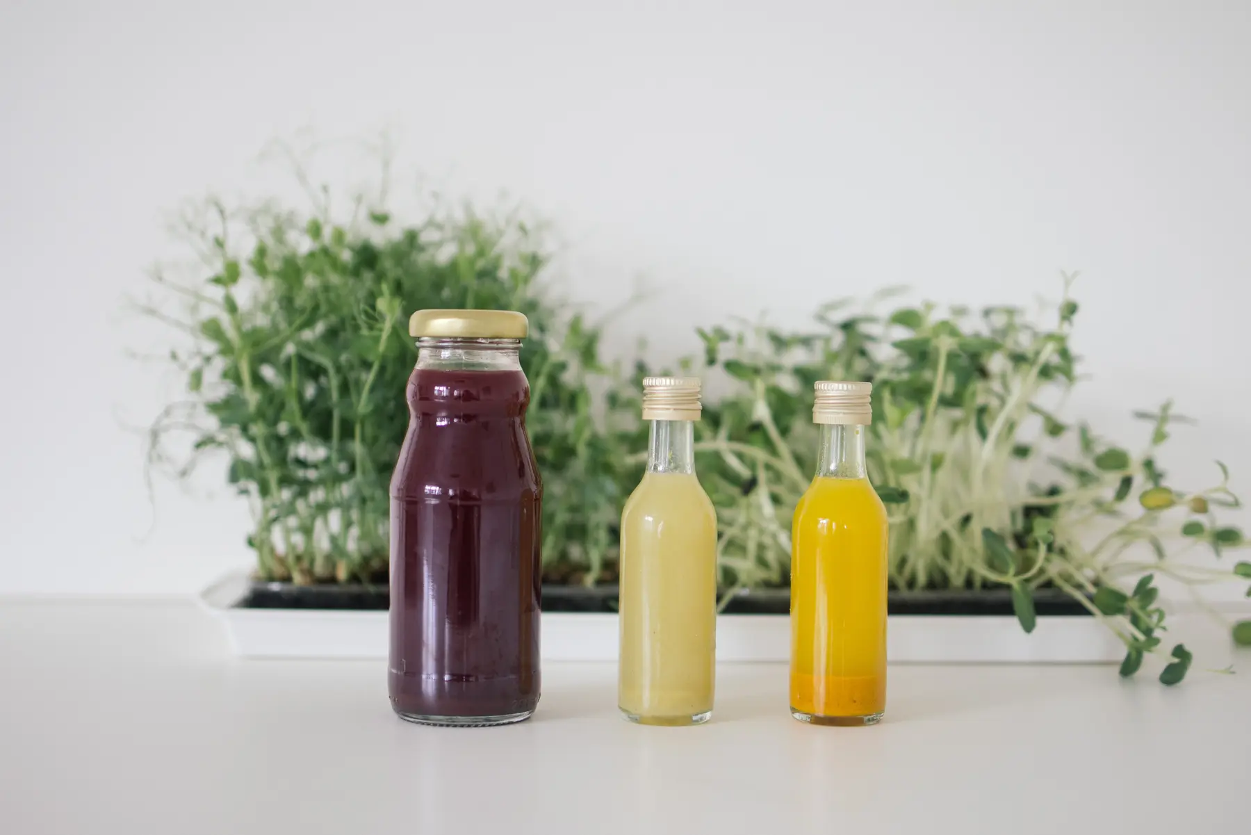
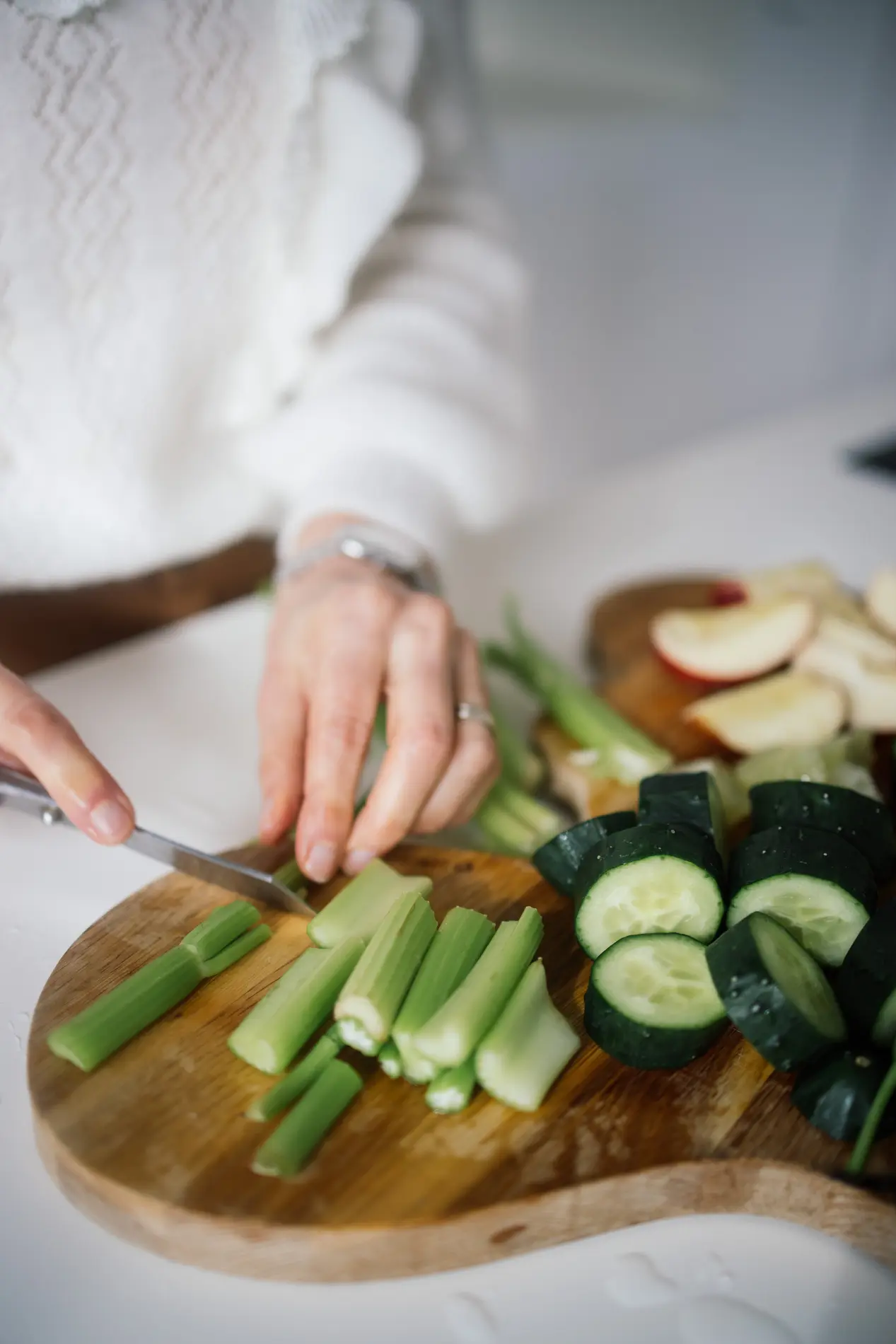
Existing booklets were redesigned as part of the same system. New layouts, covers and AI illustrations gave them a more recognisable visual language without the cost of traditional illustration production. AI was not presented as the author of expert content. It was used as a production tool for visuals.
05 · What was delivered
The focus moved from a generic wellness impression to Sandra's expertise, experience and personal way of working.
Services, content, booklets and collaborations were separated so visitors no longer have to guess where to click.
The language became more conversational and concrete, with clear boundaries between education, consultation and medical treatment.
Consultations, talks, workshops and digital booklets each received a clear role and path to enquiry.
Existing materials received new layouts, covers and a more coherent visual system.
Illustrations were created with AI tools because the project did not have the budget for traditional illustration production.
The blog, glossary, FAQs, media and collaborations became a durable knowledge base rather than content that disappears in a feed.
A free weekly meal planner was developed without login requirements or sending user data to Sandra.
An eight-step prototype and time-limited invitation concept were designed without presenting the prototype as a finished secure system.
The structure covers consent, privacy, service terms and safer handling of health data.
The concept prepares future digital product sales and transparent partner links without invented pricing or commission claims.
Content, navigation, forms and interactive steps were adapted for mobile, keyboard use and clearer reading.
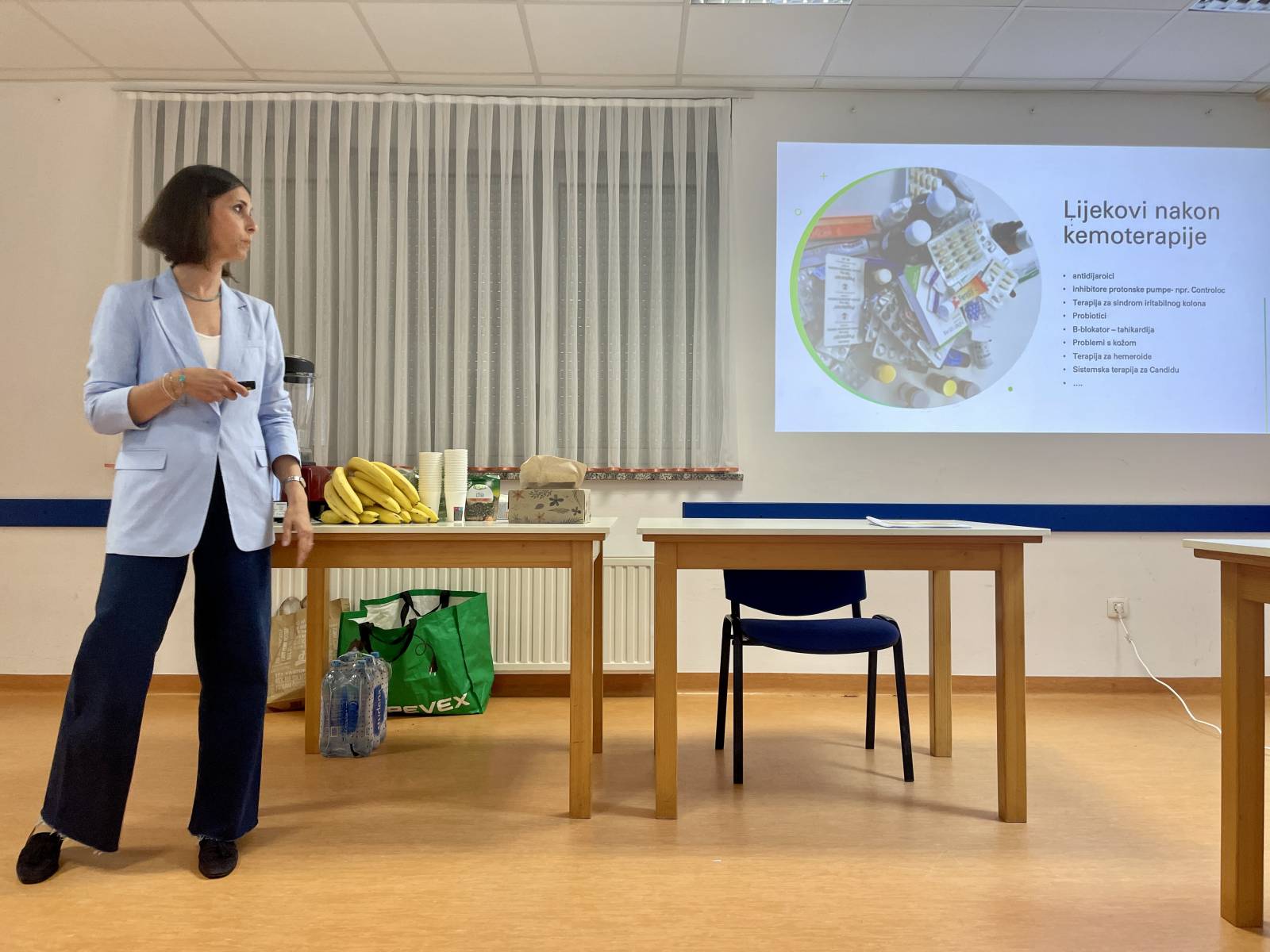
06 · Old website archive
07 · Outcome
The new concept makes it clearer who is speaking, what knowledge supports the work, who it helps and where the service ends. Existing material gained a new role, the booklets were prepared for future digital sales, and tools and content create value before an enquiry is sent.
The project was developed as a concept and functional prototype within a low or no-budget framework. Payments, secure health-data storage and legal approval remain separate production phases, and the website does not pretend otherwise.